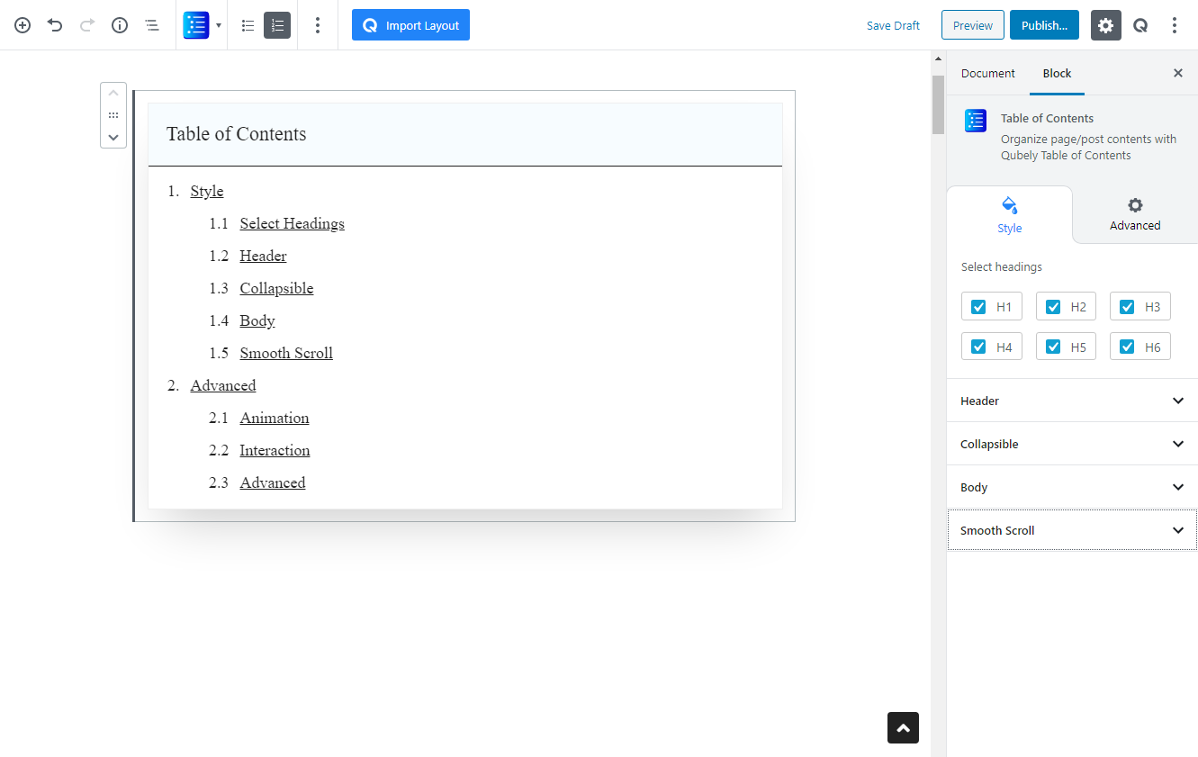
Table of Content block offers a quick way of navigating through longer blog posts or pages. They also enable a site visitor to skim through the headings to get an overall idea about the contents of the page. If you’re a blogger creating tons of content daily, or a site administrator that wants quick in-page navigation, this is the perfect block for you.
Style
Select Headings
Check the headings that you want to fetch from this page. This will attach the headings from the page/post to your Table of Content. Consequently, you can choose to remove some specific headings from the table.
Header
Color: Use this RGBA color picker to change the color of the header text. You can also click on the icon next to it to return to the default color value.
Background: Use this RGBA color picker to change the color of the header background. You can also click on the icon next to it to return to the default color value.
Font Size: Use this slider to change the font size of the heading text. The units are in px (pixels). You can also use the responsiveness tabs to tweak for all display sizes.
Padding X: Set a padding along the X-axis of the heading section. This padding will also be set relative to the alignment settings. The units are in px (pixels). Responsiveness tabs are also present.
Padding Y: Set a padding along the Y-axis of the heading section. This padding will be set on both the top and bottom of the heading text. The units are in px (pixels). Responsiveness tabs are also present.
Border Separator: Enable this toggle to add a border separator between the header and the body.
Border Width: Choose a width for the border separator. The units are in px (pixels). Responsiveness tabs are also present.
Border Color: Choose a color for the border separator using this RGBA color picker.
Collapsible
Enable Collapsible: Use this toggle to enable a collapsible body section of the table.
Alignment: Pick an alignment mode for the text in the header section.
Button Type: Choose the type of button you want for the collapse button:
- Text:
- Open Text: write the text of the button when the body section is open
- Close Text: write the text of the button when the body section is closed
- Icon: Choose which icon you want as the button.
Body
Background Color: Choose the background color of the body section in this RGBA color picker.
Background Type: Pick between two background types:
- Image: Pick a background image of the body. Use the insert button to insert from the Media Library, or upload the image.
- Gradient:
- Color picker: Pick two colors for the gradient background. The gradient will be generated between these two colors.
- Gradient Type:
- Linear: Picks a linear gradient model that applies the gradient on an axis.
- Gradient Angle: Pick the angle of the axis on which the gradient will be applied.
- Radial: Picks a radial gradient model, where the gradient will be generated from a certain point.
- Radial Pointer: Pick the point where the color will generate from.
- Color 1 Stop: Pick the color 1 stop position. The higher it is, the sharper the gradient shift
- Color 2 Start: Pick the color 2 start position. The lower this is, the sharper the gradient shift.
- Linear: Picks a linear gradient model that applies the gradient on an axis.
Font Size: Pick the font size of the body content. Responsiveness tabs are also present. The units are in px (pixels).
Indent: Pick the size of the indent between the child and the parent heading in the table body. The units are in px (pixels).
Padding X: Pick the padding size placed between the text and the left border of the body. Responsiveness tabs are also present. The units for this slider are in px (pixels).
Padding Y: Pick the padding size placed between the text and the top and bottom border of the body. Responsiveness tabs are also present. The units are in px (pixels).
Border: Pick a border type for the Table of Contents block.
- Border Color: Pick a border color using the RGBA color picker.
- Border Width: Pick a border width for the block. You can choose to create a uniform border or choose different borders for each side of the block. Responsiveness tabs are also present. You can choose from three different units for this slider: PX, EM, and percentage.
Box Shadow: Enable this toggle if you want a box-shadow effect around this block.
- Color: Lets you choose the color of the shadow.
- X: Lets you define the length of the shadow in the X-axis.
- Y: Lets you define the length of the shadow in the Y-axis.
- Blur: Lets you control the blurriness of the shadow.
- Spread: Lets you control how far the shadow will spread.
- Inset: Enable this feature if you want the shadows to be drawn inside the border.
Body: Pick the radius on the Table of Contents block. This will create a rounded square effect on the block. You can either pick a uniform radius or pick specific radii values for each corner. Responsiveness tabs are also present. You can choose from three different units for this slider: PX, EM, and percentage.
Smooth Scroll
When you enable this toggle, it will apply a smooth scroll effect when you click on one of the headings in the table. If this toggle is disabled, you will jump directly to the heading instead of scrolling smoothly.
Scroll offset: This value defines the position of where the scrolling will end after clicking on a certain link/heading.
Enable Back To Top: This toggle will enable a button that will take you back to the top of the page.
- Icon: Choose an icon for the back to top button.
- Button Position: Choose where the button will sit: to the left or right of the webpage.
- Button Offset: Choose the y-axis offset of the button.
- Button Size: Select the size of the button.
- Button Color: Choose the color of the button’s icon from the RGBA color picker.
- Button Background: Choose the color of the button’s background from the RGBA color picker.
- Button Radius: Choose the radius of the button’s corners. You can use this to add a rounded corner effect to the button. You can also create a circular button using its highest value.
Advanced
Animation
To make the block more interesting, you can add an animation effect. It is disabled by default, to enable this feature, choose an effect from the dropdown list. Once you choose your desired one, then start making modifications as you see fit. The units are in milliseconds. Note: Duration is how long the animation will run and Delay is the waiting time before the animation starts loading. The following effects are currently available.
- Fade: Selecting this will animate your table of contents block with a fading animation.
- Slide: Animate your table of contents block with a sliding animation.
- Bounce: If you want to animate your table of contents block with a bouncing animation then select this.
- Zoom: This option will animate your table of contents block with a Zooming animation.
- Flip: Animate your table of contents block with a Flipping animation using this option.
- Fold: Selecting this will animate your table of contents block with a sliding animation.
- Rotate: This will animate your table of contents block with a rotating animation.
Note: You can control from which direction the animation will start such as from the center, right, left, up or down. Also, control how many times the animation will repeat. You can also select the duration and the starting delay of the animation in milliseconds.
Interaction
Enable Tablet: If you want to enable the interactions for tablet users to enable this to start showing tablet users the image interactions.
Enable Mobile: If you want to enable the interactions for mobile users to enable this to start showing mobile users the image interactions.
Enable Mouse Movement: You can select the way how your interactions work with your mouse movement. There are multiple options once you enable it. You can choose the direction from Direct/Opposite, speed from a scale of 1 to 10, maximum from a scale of 5 to 75.
Live Button: This button will give you “Live experience” on how your interactions work depending on how you set it. Click on it to get an overview.
Advanced
This section lets you override the current styling of this particular block.
Enable Custom Position: If you want to set the block to a custom position then simply enable this option. After enabling you will find the following options
From X-axis: Select from the slider what position you want the image block to be in according to the X-axis. The range limits from -2000 to 2000.
From Y-axis: Select from the slider what position you want the image block to be in according to the X-axis. The range limits from -2000 to 2000.
Z – Index: If any of your blocks override another, then you can set a value here, the one with the higher value will appear before the other.
Hide on Tablet/Phone: Turn it on to hide this block in your desired device. The change will appear on the frontend.
Block Row CSS: In case you need to override current block settings, you can write down your own code followed by {{QUBELY}} to override the current settings.Additional CSS Class: You might need to name a block in order to make custom modifications in the future, this is the field where you define the name.