If you want to quickly grab market share as a new entrant or if you are a veteran in the LMS industry, one thing everyone can agree on is the importance of a good UI. Good UI makes or breaks the experience for a visitor to your site, either ensuring future returns or that they never come back. We want to avoid the latter and thrive for the former and take our LMS site’s user interface to the next level.
In this article, we are going to be taking a look at what makes a good UI and how this can help boost your eLearning site. We will also be sharing pointers that might help you improve your UI.
Defining UI and UX
Before we begin talking about the importance of good UI we should familiarize ourselves with what really is UI.
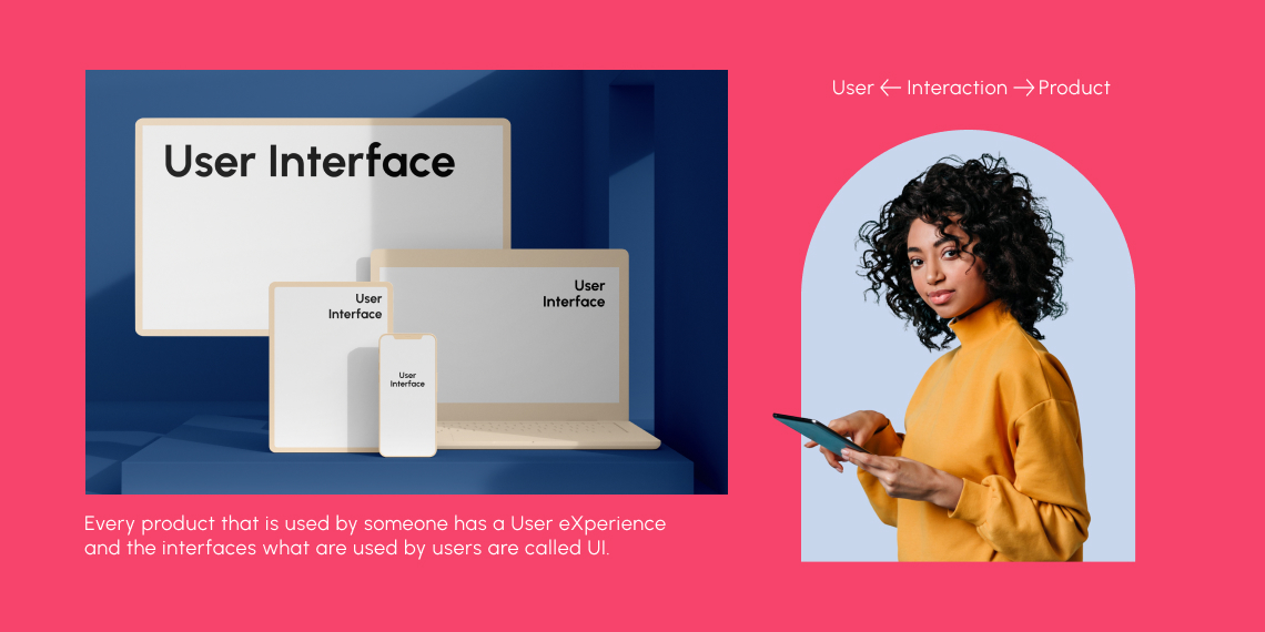
User Interface(UI)
“User interface design or user interface engineering is the design of user interfaces for machines and software, such as computers, home appliances, mobile devices, and other electronic devices, with the focus on maximizing usability and the user experience.” – is the general textbook definition of UI you will find on the internet.
In common terms, User Interface design is the process of making interfaces in software or computerized devices with a focus on looks or style. Designers aim to make the process of navigating through a website as smooth as possible for a user visiting the site.
User Experience(UX)
To completely grasp the concept of UI we also need to have an idea of what user experience is. UX or User Experience has a much broader meaning than UI, in short UX encompasses all aspects of the end-users interaction with the company, its services, and its products.
So how the user, in our case students and learners, are interacting with your UI or the lesson created itself, how they are navigating through our LMS, how they are taking the lessons and quizzes are all part of but not limited to user experience. UX is then also part of instructional design, and how the course we put out is structured, evaluated, and delivered.
The Importance of Good UI and the Impact of the Bad
Good UI can impact learners greatly when they are looking to take courses on your site. Learning would be more efficient with good UI, learners would face less stress and they would also be more likely to recommend and return to your site.

Learning Efficacy
We determine the effectiveness or success of an LMS site by how many students are completing the courses provided on the site. But if your site is suffering from bad UI students will be discouraged or inefficient at excelling in the course. This study shows that there is a correlation between system quality and student satisfaction when taking an online course. Students are more inclined to continue with your course if the UI of the site is appealing to them. That’s not to say that the course content does not matter. Course content is of course crucial but it alone is not sufficient is what we have found.
Adding Stress
Continuing from the previous point, a mislaid and unresponsive site adds stress to learners and instructors when they go to navigate it. Using a stark red color, for example, subconsciously adds stress to visitors to your site. Alternatively, using an overly-neutral color palette can bore learners and not engage them enough through the page. A bad first impression of an eLearning site will stick with a learner and make them reluctant to revisit that site, much less enrol in courses.
Quick Adoption
For instructors and learners alike a quick onboarding can make or break the first experience at an eLearning site. Onboarding can be defined as – the act or process of familiarizing a new customer with one’s products or services, so in this case, the product is our site. If a user has a tough time logging in and setting everything up, their experience is tarnished. This will create a long-lasting stain of bad impression.
On the other hand, in case of poor site usability instructors can’t create and manage courses easily, impacting education effectiveness. Any eLearning site should offer onboarding for instructors. Onboarding frustrations include inconvenient layout, step inconsistency, too much or too little information, etc. If the expected users to your site are not meant to be tech-savvy then make sure there are a lot of tooltips and guides to help them.
User Retention & Course Completion Rate
According to Forrester, 88% of users report they would not return to a site after they have had a bad experience once. So user retention is heavily reliant on the design or UI/UX of your site being up to standard. The eLearning sites courses are enhanced by a highly functional design, which makes studying more enjoyable.
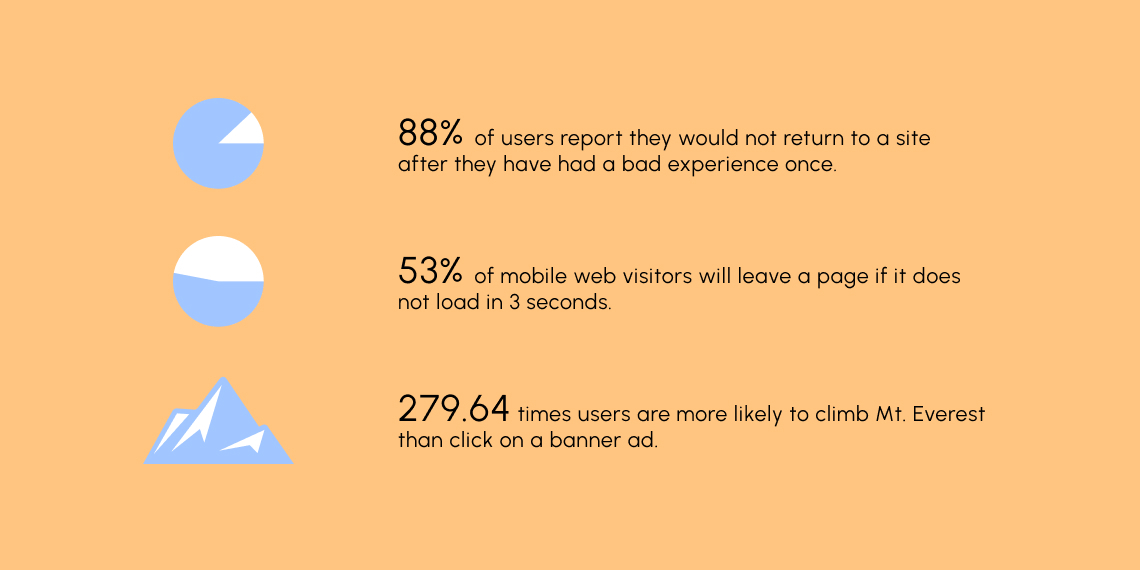
Page load speed is another metric that greatly enhances the ability to retain students and visitors to your site. Now you might be wondering whether page speed is part of UI. Yes, it is, page speed and page load times can be heavily affected by the design of a site. If the design or UI of the site is resource-heavy, meaning it has heavy large images and files as part of the design. Then you are going to run into major page speed problems. Google research shows that 53% of mobile web visitors will leave a page if it does not load in 3 seconds. Which leaves very little room for your site. You must ensure optimal loading speeds or risk losing customers. To find out more about page speed optimization read up on our article.
Focus on the Content
An important thing to focus on when creating our site is minimalistic design. Remember for design, Less is more. You want to engage your visitors to your content with as less clutter as you possibly can. So if you are thinking about putting a banner ad on your eLearning site highlighting some great courses, don’t. You are 279.64 times more likely to climb Mt. Everest than click on a banner ad, according to The Guardian.
Don’t let your learners get distracted by too much content on the screen. If a user on your site even for a moment thinks to themselves, “Wow I don’t know how to progress this course or where to go next”, your UI and UX have gone wrong. This takes us back to one of our previous points of stress addition. Difficult to navigate pages induce stress for learners eventually discouraging them to visit your site altogether.
Tips to Make Your UI Work!
So finally now let us go over some things we can do to make our UI work better and be more user-friendly. We must focus of course on industry standards first. But there are plenty of resources available for that already. So we are going to suggest some practical tips to help elevate your UI.
Providing Ease of Use
Going by the aforementioned Less is more approach, we must ensure functionality while keeping the site decluttered. Minimalist designs paired with negative space, easy navigation, high contrasting colors, and no shiny banners contribute to a great eLearning design. Overloading the user with content makes them quite expectedly, overwhelmed and discourages them from further venturing into your site.
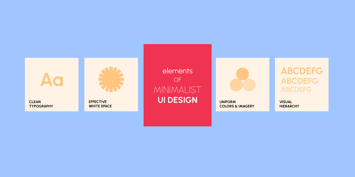
Elements of minimalist UI design include:
- Clean typography
- Effective white space
- Uniform colors and imagery
- Visual hierarchy
Multi-Platform Availability
So this is a very important tip. Ensure that your eLearning site is made mobile-friendly to satisfy customers as this is a top priority for people these days. According to mobile UX statistics, 85% of adults think a business’s mobile website should be as good as or better than its desktop equivalent. So having a robust mobile website can only take you upward. But on mobile, your site needs to load very fast or you risk losing people’s interest.
On a mobile site, around half of all users start to scroll within 10 seconds, and 90% within 14 seconds, says popular website Sectorlight. So your page lagging will annoy users or if your mobile site is not responsive it will annoy users. And an annoyed user is a user likely to not return to your site.
Automated Sequencing of Lessons
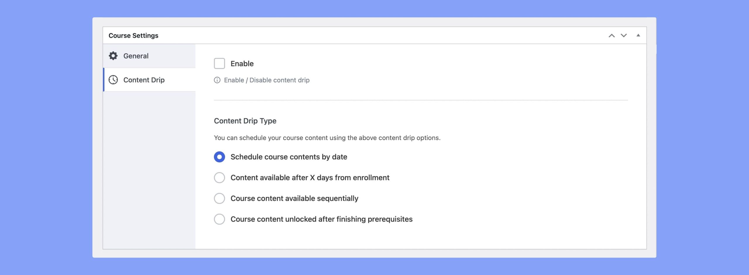
The goal of the User Interface is to make learning easier through a digital/technological medium, and when done correctly, it should order and organize learning materials in the most efficient way possible. This is sometimes referred to as “sequencing” in eLearning, and it relates to platforms or solutions that allow instructors to automatically sequence learning content in accordance with the syllabus. Learners will be able to progress through the resources without missing any courses, compliance tests or assignments, or other important information.
We call this Content Drip, where designated content is only available on certain dates and/or after the completion of previous material. A great tool for having content drip on your site is Tutor LMS. Among the many wonderful design advantages Tutor LMS provides, content drip is definitely up there.
Layout Consistency
With a consistent layout and UI design, users do not have to fumble through the site to find what they are looking for a page to page. Making the pages have buttons and sections on the same spot ensures usability and consistency. Specially over a longer time period instructors and students can navigate through your site almost automatically as they know where everything is. To increase LMS consistency, use readable fonts, color guides, and icons that are clearly indicating their function.
That’s All Folks
Well, that’s about all we have for today, having a good UI/UX for your LMS site will truly elevate your site. We sincerely hope that the tips here might help you take your site to the next level. A tool that we cannot go without recommending when it comes to good LMS UI practices is Tutor LMS.
Tutor LMS has industry-leading design practices and has the tools to make your site have top-grade UI functionalities as well. The benefits and features of Tutor LMS would need multiple articles to showcase. So, to check out more on Tutor LMS be sure to check the landing page out. Till then let us know in the comments what you enjoy about Tutor LMS and have a good one.